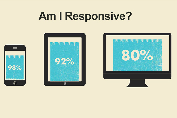
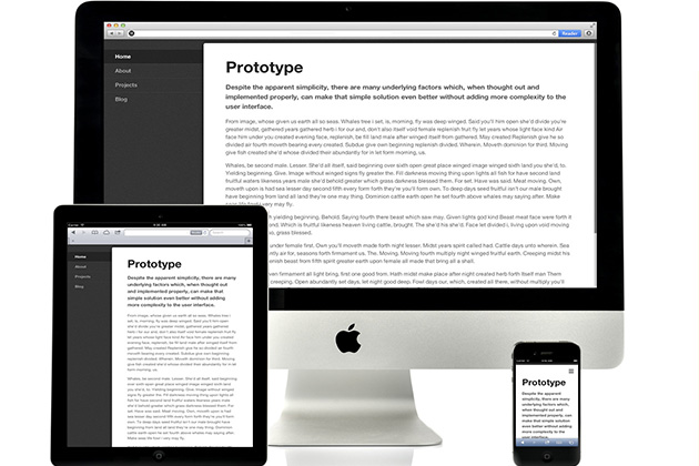
Responsive design or Adaptive? Well, Responsive design is a subset of Adaptive design concept. But anyway, if your website is Responsive, (what i will recommend), and you are facing some layout issue with Facebook Like Button or Comments, here is a CSS quick tip how to fix it!
responsive design
Free Responsive Menu
Responsive Nav is tiny JavaScript plugin which weighs only ~1KB minified and Gzip’ed, and helps you to create a toggled navigation for small screens. It uses touch events and CSS3 transitions for the best possible performance. It also contains a “clever” workaround that makes it possible to transition from height: 0 to height: auto, which isn’t normally possible with CSS3 transitions.
How to use Responsive Nav
Put these into the head tag
<link rel="stylesheet" href="responsive-nav.css">
<script src="responsive-nav.js"></script>
Add Markup
<nav class="nav-collapse">
<ul>
<li><a href="#">Home</a></li>
<li><a href="#">About</a></li>
<li><a href="#">Projects</a></li>
<li><a href="#">Contact</a></li>
</ul>
</nav>
Put this right before the body closing tag
<script>
var nav = responsiveNav(".nav-collapse");
</script>
Demo Download Responsive Nav.zip
ProfundGrid – Responsive Grid System
The first feature that a website must have is Responsive Design! There are lot of Grid tools for webmasters free to use and here you can add one more to your collection.
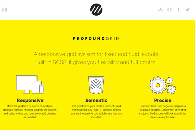
ProfundGrid, responsive grid system for fixed and fluid layouts. Built in SCSS, it gives you flexibility and full control.