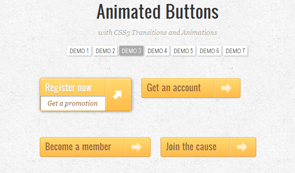

CSS3 is the latest standard for CSS and is supported from your browser if you are running at least one of the latest release. So, if you aren’t seeing any animation, probably your browser doesn’t support CSS3, but you can update it. In this post I will show some code how to create a Animated Buttons without any flash or script, just CSS3.
The HTML code will be the following: <a class="a-btn" href="#">
<span class="a-btn-text">Register now</span>
<span class="a-btn-slide-text">Get a promotion</span>
<span class="a-btn-icon-right"><span></span></span>
</a>
Now on the CSS style you must paste these properties:
.a-btn{
    background: linear-gradient(top, #feda71 0%,#febb4a 100%);
	border: 1px solid #f5b74e;
    border-color: #f5b74e #e5a73e #d6982f;
    box-shadow: 0 1px 1px #d3d3d3, inset 0 1px 0 #fee395;
    padding: 0px 80px 0px 10px;
	height: 38px;
	display: inline-block;
	position: relative;
	border-radius: 4px;
	float: left;
	margin: 10px;
	overflow: hidden;
	transition: all 0.3s linear;
}
.a-btn-text{
	padding-top: 5px;
	display: block;
	font-size: 18px;
	white-space: nowrap;
	color: #996633;
    text-shadow: 0 1px 0 #fedd9b;
	transition: all 0.3s linear;
}
.a-btn-slide-text{
	position:absolute;
	top: 35px;
	left: 0px;
	width: auto;
	right: 52px;
	height: 0px;
	background: #fff;
	color: #996633;
	font-size: 13px;
	white-space: nowrap;
	font-family: Georgia, serif;
	font-style: italic;
	text-indent: 15px;
	overflow: hidden;
	line-height: 30px;
	box-shadow:
		-1px 0px 1px rgba(255,255,255,0.4),
		1px 1px 1px rgba(0,0,0,0.5) inset;
	transition: height 0.3s linear;
}
.a-btn-icon-right{
	position: absolute;
	right: 0px;
	top: 0px;
	height: 100%;
	width: 52px;
	border-left: 1px solid #f5b74e;
	box-shadow: 1px 0px 1px rgba(255,255,255,0.4) inset;
}
.a-btn-icon-right span{
	width: 38px;
	height: 38px;
	opacity: 0.7;
	position: absolute;
	left: 50%;
	top: 50%;
	margin: -20px 0px 0px -20px;
	background: transparent url(../images/arrow_right.png) no-repeat 50% 55%;
    transition: all 0.3s linear;
}
Now we have to add the active and hover status for the button:
/*hover status for the button*/
.a-btn:hover{
	height: 65px;
	box-shadow: 0px 1px 1px rgba(255,255,255,0.8) inset, 1px 1px 5px rgba(0,0,0,0.4);
}
.a-btn:hover .a-btn-text{
	text-shadow: 0px 1px 1px rgba(0,0,0,0.2);
	color: #fff;
}
.a-btn:hover .a-btn-slide-text{
	height: 30px;
}
.a-btn:hover .a-btn-icon-right span{
	opacity: 1;
	transform: rotate(-45deg);
}
/*active status for the button*/
.a-btn:active {
	position:relative;
	top:1px;
	background: linear-gradient(top, #fec354 0%,#fecd61 100%); /* W3C */
    border-color: #d29a3a #cc9436 #c89133;
    text-shadow: 0 1px 0 #fee1a0;
    box-shadow: 0 1px 1px #d4d4d4, inset 0 1px 0 #fed17e;
}
The source code was provided by tympanus.net where you can find also other CSS3 Animated Buttons.